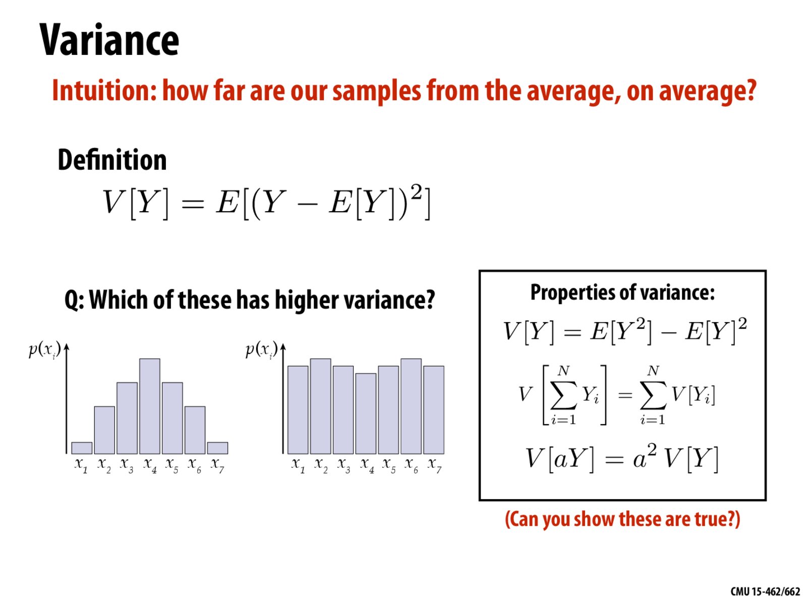
In lecture, Professor Pollard said the right one had lower variance. I think she misunderstood the graphs and that the left one has lower variance.
nsp
Yes, you are absolutely right. To explain, the plots show a probability distribution. In other words, if we draw samples and plot their values, we could get histogram curves like those shown. We want to know which collection of samples would have lower variance. That would indeed be the plot on the left, intuitively because more of the samples would be clumped up closer to the mean.
In lecture, Professor Pollard said the right one had lower variance. I think she misunderstood the graphs and that the left one has lower variance.
Yes, you are absolutely right. To explain, the plots show a probability distribution. In other words, if we draw samples and plot their values, we could get histogram curves like those shown. We want to know which collection of samples would have lower variance. That would indeed be the plot on the left, intuitively because more of the samples would be clumped up closer to the mean.
Thank you for pointing this out.