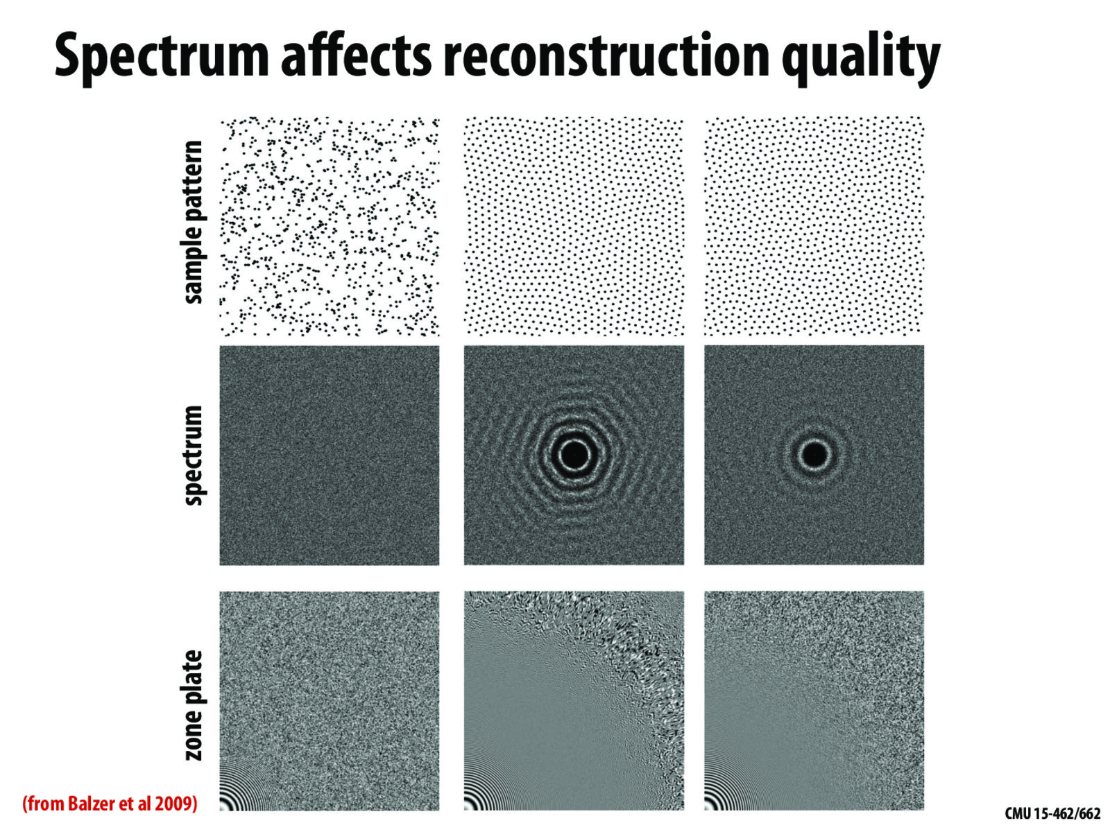
For those we are wondering where these three columns of images come from, these images comes from Balzer et al's paper "Capacity-Constrained Point Distributions: A Variant of Lloyd's Method". (https://dl.acm.org/doi/pdf/10.1145/1531326.1531392)
The left column is the "initial point set", which I guess basically means a set of uniformly sampled points.
The middle column is the result of the point set optimized by Lloyd's method, after "alpha" converges. The paper stated that after some iterations Lloyd's method will actually deteriorates the spectral properties of the point set and introduce some hexagonal structures in the spectrum image.
The right column is the result of the result of the new method introduced by the paper. As you can see, it can produce better spectral properties and can do a better job of sampling the zone plate.
For those we are wondering where these three columns of images come from, these images comes from Balzer et al's paper "Capacity-Constrained Point Distributions: A Variant of Lloyd's Method". (https://dl.acm.org/doi/pdf/10.1145/1531326.1531392) The left column is the "initial point set", which I guess basically means a set of uniformly sampled points. The middle column is the result of the point set optimized by Lloyd's method, after "alpha" converges. The paper stated that after some iterations Lloyd's method will actually deteriorates the spectral properties of the point set and introduce some hexagonal structures in the spectrum image. The right column is the result of the result of the new method introduced by the paper. As you can see, it can produce better spectral properties and can do a better job of sampling the zone plate.